
Assignment:
We had to create and publish a new website for our art work!
Craft:
I used as plain black design as a background. This I feel makes my work stand out better than on a cluttered busy webpage.
Composition:
I placed each piece on its own page. That way the image is the center focus of the viewer.
Concept:
To complete a website for VisCom highlighting my artwork. Most everyone else in the class created busy webpages that look awesome but their work gets lost in the page. I wanted to create a plain webpage so that my work is at the forefront.
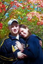
craft: i like how you chose to have the background of your blog be a dark color, such as black, because it helps your entries and pictures stand out more. I like how you chose the red and yellow. those colors have a good contrast with the black background. i also liek the picture you chose for the link for your website. it shows you are a friendly person, and makes people want to see visit your site and see what else we can learn about you.
ReplyDeletecomposition: your blog is very organized with all the weekly entries in order and you have all the necessary information. your pictures for week 11 and 12 made me want to visit your site to see the whole story of your comic. your pictures for week 4 and week 6 also intrigued me. They seemed like interesting art works and i wanted to know more.
concept: the point of these blogs is to show off your artwork to your fellow classmates. with each week, we can see how you did what you did, why you chose to do that project, and the challenges you faced while doing it. also, these blogs are supposed to express yourself as a person, not just an artist. with links such as view my complete profile, you allow us to get to know you a little better.
This comment has been removed by the author.
ReplyDeleteCraft- Your black background makes things easily pop out. Your blog reminds me of a traffic light in the night time. Very simple and easy to look at.
ReplyDeleteCompostion- It is very simple. You can't get lost. Your pictures really popped out since there a dull green comic.
Concept- The objective of this site was to promote your artwork and show your progression over Visual Communcations Art 100. I think you acheived that objective.